Bringing AI to Purium
Design Prototype

Purium Companion App

Twenty-one screens settling what a product should be, before anyone writes it
Interactive  ·  Tap through it

The prototype opens in the browser. Nothing to install.

Twenty-one screens across four audiences, self-contained in a single file. It opens in the gallery view showing every screen at once; switch to Prototype at the top right to tap through the flow the way a customer would. Reading about it is the slower way to understand it.

21 screens  ·  4 audiences
Drafted from a full PRD
Open the prototype →
What This Is

This one is a prototype.


Everything else in this portfolio is running, and this one is not. It is a design prototype: twenty-one screens you can tap through, with no database behind them and no customers using them.

I built it because the expensive mistakes in software happen before any code exists. A team can spend months building the wrong thing, and the wrong thing usually looks reasonable in a conversation. Screens settle arguments that words keep open. What does a customer see on day fourteen of ninety? Where does a Brand Partner find out their team has gone quiet? What does the person maintaining the product schedule touch? Those questions have answers here, and the answers are specific enough to disagree with.

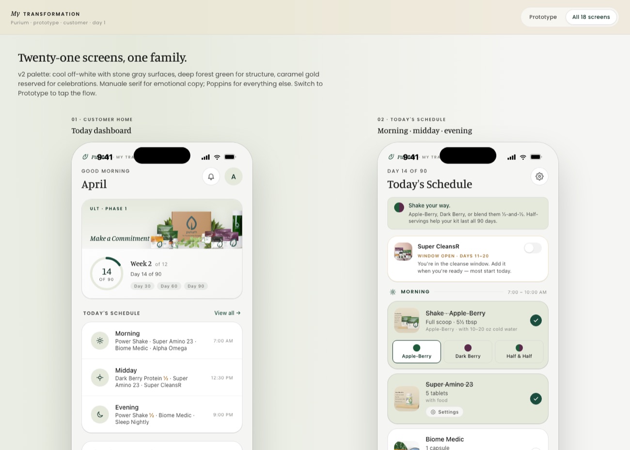
The prototype gallery: the customer home screen and the daily schedule screen, side by side as phone mockups
The gallery view. Every screen is laid out side by side so the whole product can be read at once, then tapped through individually.
01   What Is In It

Four people use this product, and they need different things.


The screens are grouped by who is holding the phone, which is the decision that shaped everything else.

None of this was designed at the screen. It came out of an extensive product requirements document written first: who each audience is, what they need at which point in the ninety days, what the product must do and what it deliberately will not. The prototype is that document made visible, and that is why the screens are specific enough to argue with. Writing the requirements first is slower on day one and the only reason twenty-one screens could be drafted without any of them being a guess.

🌿The customer

Ninety days, one day at a time

A daily dashboard that knows which day of ninety it is, the morning, midday and evening schedule with the right dose for the right window, a check-in across six dimensions that takes under two minutes, hydration tracking, a daily lesson, and an end-of-day recap. Milestones at thirty, sixty and ninety days are treated as moments rather than rows in a table.

The person doing the program
🤝The Brand Partner

Their own journey, and their team's

A dual-journey home: a partner is doing the ninety days themselves while supporting people who are also doing it. New customers, who is approaching a milestone this week, and who has gone quiet for four days or more, so the outreach is prompted rather than remembered. Plus the Fast Start checklist for a partner in their first ten days.

Doing it and leading it at once
👑The leader

Organization health in one number

Active customers, the seven day check-in rate, how many are new and how many have gone quiet, with the trend against last week. Milestone activity for the week and which parts of the organization are strongest. The number that matters is the check-in rate, because it predicts everything downstream.

Seeing the whole picture
The administrator

The schedule everyone else receives

Where the product schedule is maintained and versioned, with a preview before publishing and a clear statement that publishing notifies every active customer. A catalog screen for updating the product reference without disturbing the personalized schedules already running.

Changing it safely
02   The Decisions Are On The Page

A prototype that documents why it looks the way it does.


The palette and type decisions are written into the prototype itself rather than living in someone's head: a cool off-white with stone gray surfaces, deep forest green for structure, and caramel gold held back for celebrations only.

That last constraint is the one I would defend. If gold appears everywhere it means nothing, so it is reserved for the moments worth marking: a milestone crossed, a streak held, a check-in saved. A serif carries the emotional copy and a sans carries everything functional, which means the tone of a screen is set before a single word is chosen.

Why a prototype is the point

It settles what the thing should be before anyone spends money finding out. Whoever builds this does not start from a brief and a conversation, they start from twenty-one screens with the arguments already had.

Thank you for spending time with this.